Contour Bias in Retail Design
Many features of the everyday objects and environments we encounter lead to us making quick judgements about them, sometimes without even realising that we have. Colour, scale and shape all have a measurable effect on how we relate to an environment or object, without us even being aware. The way we perceive the profile and shape of objects or environments is known as Contour Bias. This concept was scientifically identified and demonstrated in 2006 by Moshe Bar and Maital Neta in their research report ‘Humans Prefer Curved Visual Objects’. It is described as a preference for contoured or curved features, over those with sharp angled features, in emotionally neutral objects.
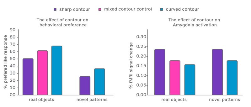
Though often the effect is talked about as our positive preference for rounded objects, it is caused by the perceived danger of sharp edges, subconsciously activated by the amygdala (the part of our brain which responsible for the emotion of fear). Over a million years of learning that sharp pointy things can hurt, have rightfully led to us evolving the innate ability to keep an eye out for them in our everyday environments. The subconscious cognitive effect of perceived danger impacts how we relate to objects and environments. The absence of sharp edges in contoured rounded objects, creates a subconscious preference for them as they do not activate the amygdala, while the presence of sharp edges activates the amygdala, and therefore a deeper processing of the object, leading us to not only be more fearful of them, but also more aware of them. These subconscious, emotive reactions can and should be used by retail designers. Sharp angular objects, as mentioned, activate the amygdala and are therefore better at grabbing attention and engaging customers - perfect for navigational signage or the ‘attract’ stage of a customer journey. On the other hand, curved rounded objects are best for making a positive, likeable impression.
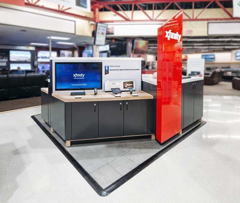
When presented with the challenge of designing a new kiosk, for the largest internet service in the US, Xfinity, Quinine looked at ways to make it stand out amongst the visually busy background of the modern shopping mall. This was achieved by incorporating an angular red column which acts as a powerful attract. Though not the only design consideration involved here, Contour Bias played its part. The striking, sharp shard almost forces the customer to notice it and draws their attention to the kiosk.
Another example of how Contour Bias is utilised, here at Quinine,
is the waiting seating we designed for Rogers Communications. This
required a different approach as the objective was to make the waiting
experience as comfortable and positive as possible. Here we used soft
contoured shapes to invite customers to dwell and relax. These are
easier for the customer to approach, as with no sharp edges they do not
activate the fear centre in our brain. Though this is obviously only one
aspect, amongst many, for the designer to consider, it is important, as
these subtle cues are often the differential between what makes an
effective design.
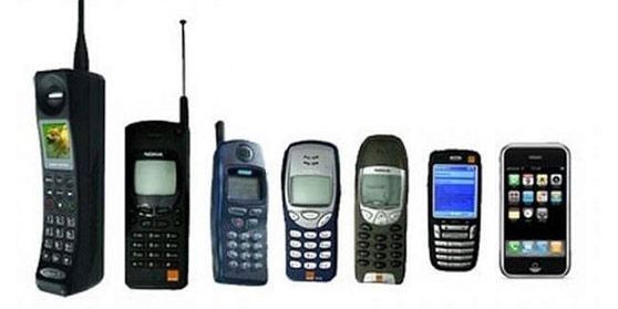
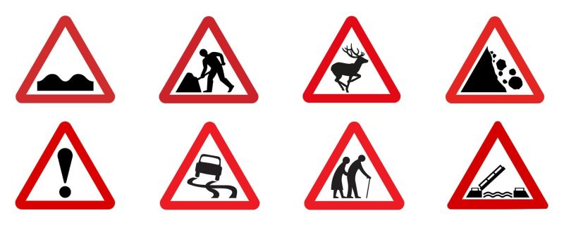
Mobile phones are another great example of how designers have taken Contour Bias on board when designing these emotionally neutral objects. Softening the edges and stripping away the sharp corners, has over time proved to be the winning design for both the physical shape of the device and its operating system interface. Most, if not all, mobile phones today have the same ubiquitous rounded rectangle shape and Contour Bias has undoubtedly had a role in this. In contrast, have you ever wondered why so many road sign warning designs use triangles, the angular shape has been proven to increase the chance that they are noticed and comprehended.
Designing for face-to-face retail is no different, it is about people and how they relate to the store. Understanding how Contour Bias can improve both the customer and staff in-store experience is a no-brainer. The design of an object or environment is the culmination of many concepts, ideas and desires, but whether designing a welcome experience, service experience or window display, it is vital for designers to take the concept of Contour Bias into account, because this bias works on a powerful subconscious level, and as we know first impressions can be hard to shift.
Design Principles is a feature on our blog where we share a ‘shallow dive’ into different theories, concepts and principles that underpin our work. The aim is to better understand design principles and their practical application in retail environments.
References
Humans Prefer Curved Visual Objects by Moshe Bar and Maital Neta


